Unpacking the project brief
For this project, we were tasked with revamping the website of SBS Transit, one of the oldest public transport operators in Singapore. Turns out, problems with our world class public transport system don’t stop at train breakdowns.
The Client
SBS Transit Limited, or SBS Transit, is a public transport operator in Singapore. It was formed in 1973 and initially ran only bus services. Over the years, it has expanded its services to cover trains and taxis, following a merger with ComfortDelGro in 2003.
The Brief
Problems and Opportunities
The satisfaction of our riders is foremost. We would like an expert view of our website which can make the following key services easy to use:
1. Search for bus services
2. Journey planners
In addition, we also seek design advice on updating the design of the website, to make the right information more easily accessible for riders.
The fact that the problem areas were already identified for us by the client made it much easier for us when we were carrying out user interviews; but while the broken and outdated website presented many opportunities for improvement, it also meant that our efforts had to be laser-focused to ensure that the 2 weeks we had were not wasted on mere aesthetic improvements (a temptation many a designer faces often).

The SBS Transit website, sorely in need of a revamp
Reconciling business and user goals
One of the earliest problems we encountered was figuring out the value proposition of our user experience improvements. Because this project was structured as a client pitch, one of our main goals was to present clearly to the audience how our UX improvements align with their business goals.
Doing some research, we soon discovered that our initial assumptions of SBS Transit’s revenue model were incorrect. Instead of obtaining revenue from passengers, SBS Transit, along with a handful of other public transport operators, run on something called the Bus Contracting Model, which means that their business goals are not to increase passenger numbers (like we initially thought) but instead to run the bus and train services efficiently so as to meet the service standards set by the Land Transport Authority.
Business stakeholders do not always understand UX. It is our job as designers to help them understand the value we bring to the table.
One thing we learnt was that in any given UX proposal, its value proposition to the business has to be clearly understood by all parties before even commencing work on the project.
Who are our users?
Like any good UX researcher, we began with an initial round of interviews with public transport users to find out whether they share any pain points and where they present opportunities for us to come up with solutions.
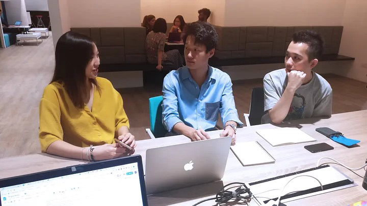
Conducting a user interview to find out her behaviour and habits
Building the Design System
We initially hypothesised that the synthesis of our user interviews would result in a few different personas. However, we discovered that local public transport users are largely similar in their behaviour and the information they require when using public transport. Instead, the information users required varied across different portions of their journeys, which we found was best illustrated using a customer journey map instead.

Looking back, I found that customer journey maps are a great way to synthesise the research data collected because it provides a very clear list of user needs our product should address. It also acted as a checklist which we could reference throughout our prototyping process to keep us on track.
UI meets UX
In designing the user interface for the revamped website, we looked at several transport operators’ websites in different cities around the world.
The Good from the Bad
What sets the good websites apart from the mediocre ones was that the best ones did not focus merely on design. While the colors and branding of these companies are clearly represented on the home page, they are also first and foremost, functional and accessible. Important information is presented clearly to users across different devices and screen sizes; the design of the sites assisted rather than hindered users from getting the information they need. In most cases, images were also used sparingly so as to improve loading times on mobile networks.
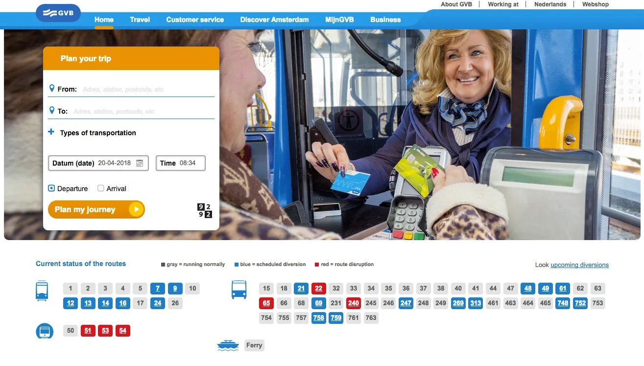
GVB, an Amsterdam-based transport operator
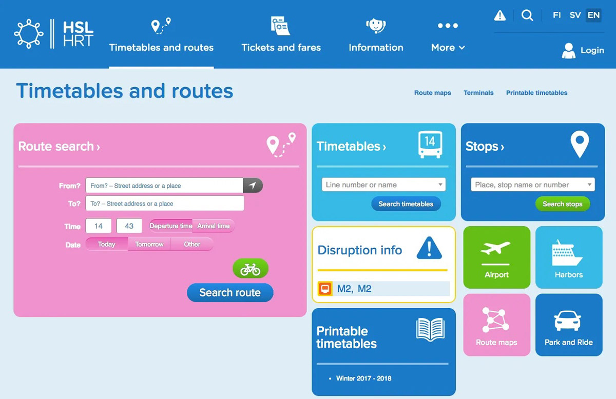
HSL, a Helsinki-based transport operator
One thing that was immediately obvious is that the route search/planner is located most prominently on the home page across almost all the sites we looked at — that makes sense since one of the main functions of these web pages is to help users find their transport options for getting around.
Some of the sites we looked at also had very clear and concise ways of displaying information on service disruptions which we ended up taking some inspiration from.
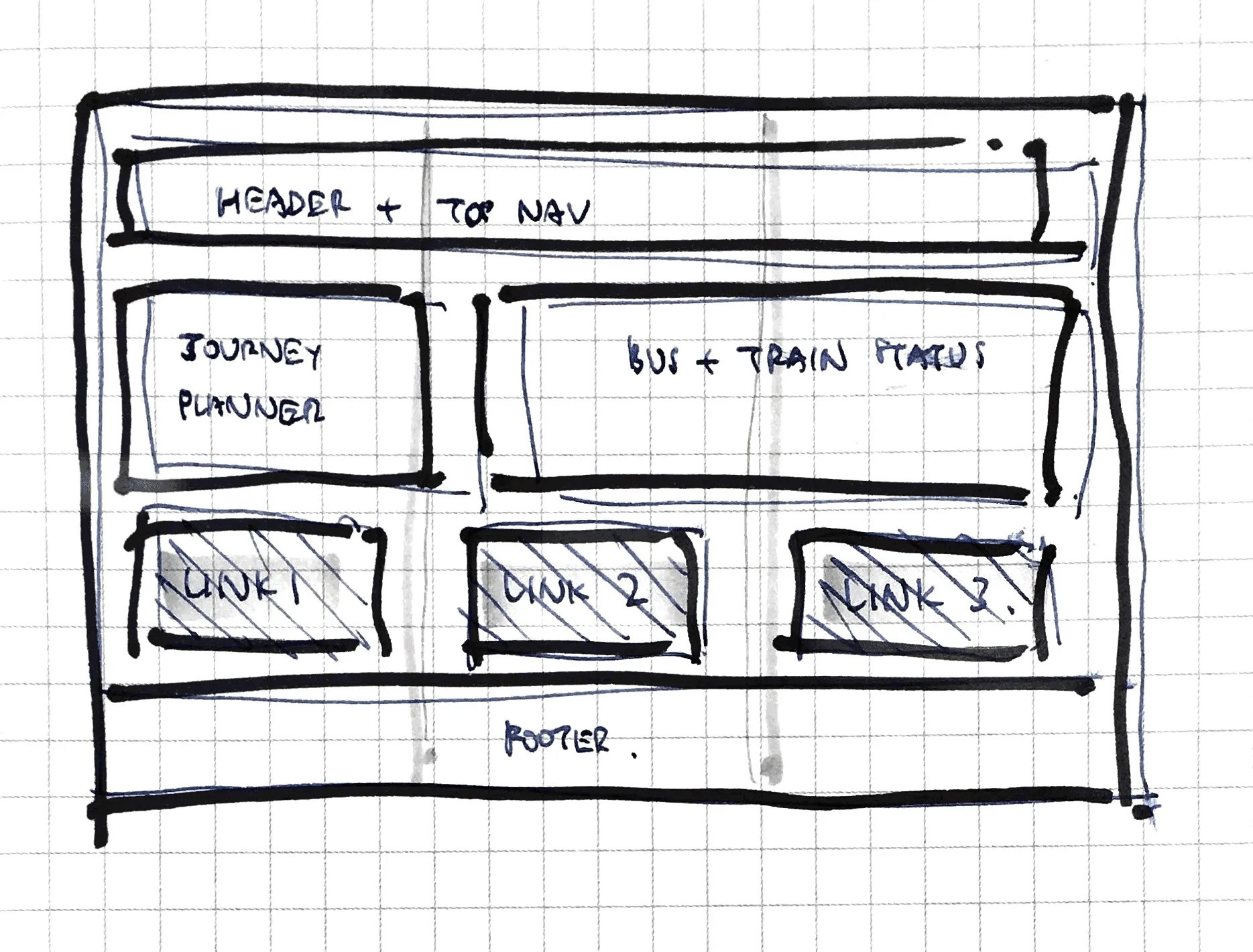
Decluttering the Site
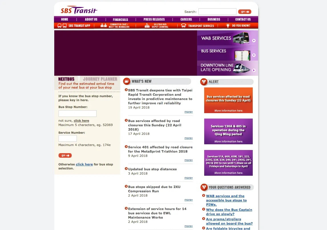
Existing SBS Transit website
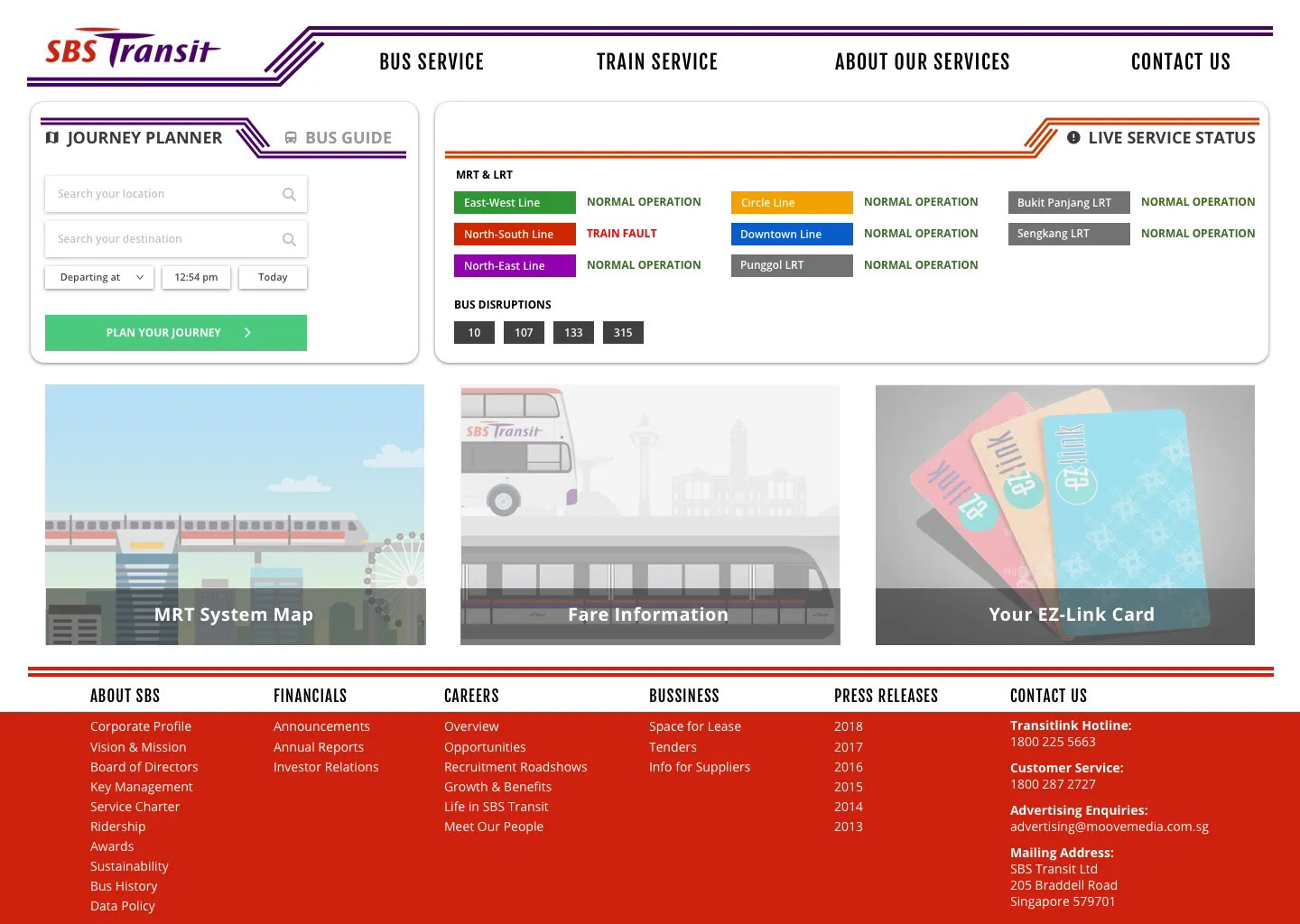
Our revamped SBS Transit website home page
Since many of our users commented that it was information they do not need in the vast majority of cases, the first thing we did was to move the less important information such as ‘What’s New’ out of the home page. By providing some hierarchical styling, we also made the Journey Planner function and the service status indicator obvious on first sight.
In addition, the main navigation menu was simplified to make it easier for users to quickly find the relevant information they require; the corporate information, for example, was repositioned to the footer area instead of taking up users’ valuable cognitive bandwidth on initial page landing.
Lessons in building a responsive website
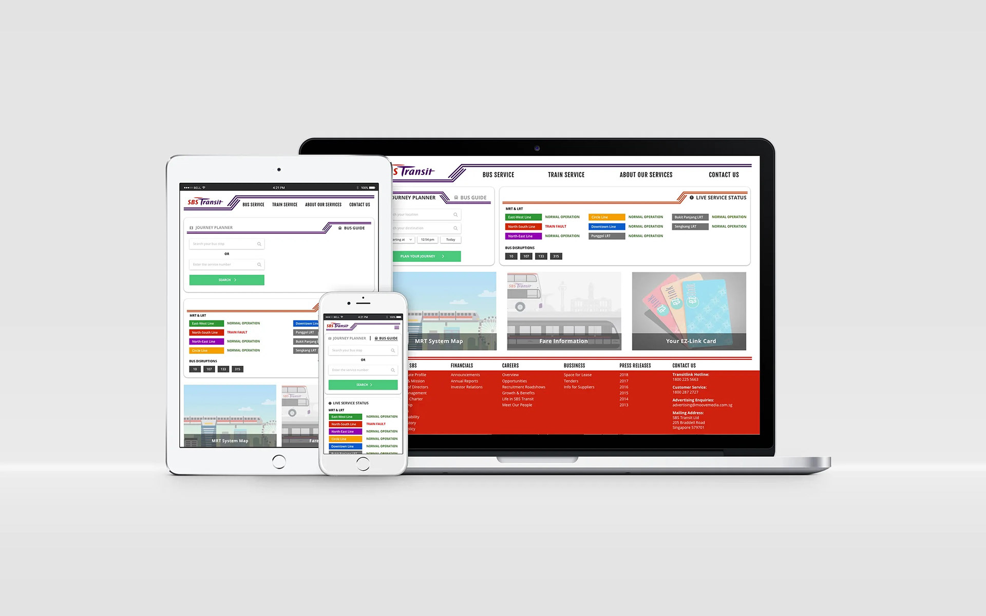
A Geometric Framework
Grid systems are extremely useful in designing layouts for digital screens, especially in adapting them to different screen sizes. One thing we learnt was that the gridded framework could provide order to the content and also help in giving hierarchy to elements on the page.
A Mobile-first Approach
When it came to the route planner and bus guide functions, we decided that designing from the mobile view first and then scaling up if necessary was the way to go.

Bus Guide (Mobile & Desktop views)
Using the bus guide as an example, once we figured out the necessary inputs on the mobile screen, it was easy to scale up the background elements (i.e the locality map) to fill the rest of the screen.
Information (over)load
One of the biggest challenge in designing interfaces for transport services is finding a suitable way to convey to users a huge amount of information. This can include bus routes, bus stop information, journey time, bus arrival times, travel distance, walking directions… the list goes on.
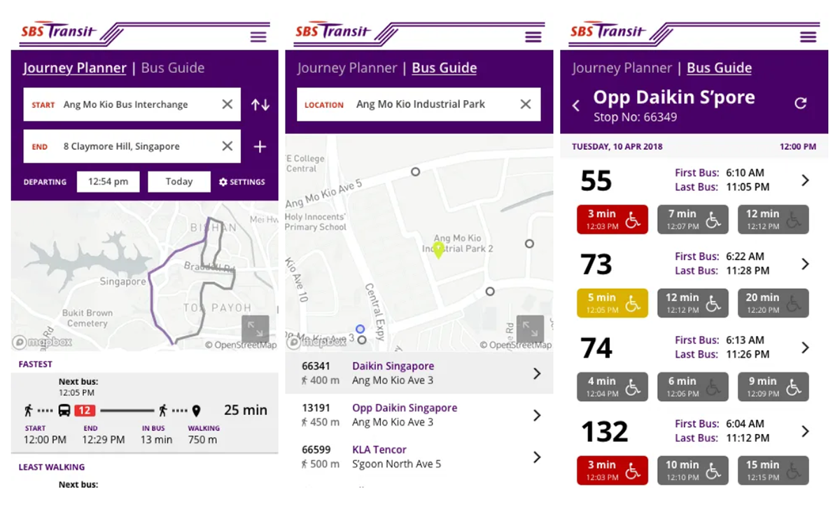
While we struggled initially with the information density, we quickly realised that a lot of important information can be conveyed more effectively graphically instead of with text. Here, we took inspiration from popular apps such as Google Maps and CityMapper and modified those interfaces according to our user needs and branding guidelines.
Key Learnings:
1. Understand users' needs and the intentions behind their actions
Everything begins from empathizing with users. What are the tasks they are trying to accomplish? What are the main obstacles to accomplishing the task? Once these questions are answered, you can easily formulate an approach to the problem and clearly explain the rationale behind every design choice. These answers are the guiding north star to the success of every product.
2. Less is more
We are bombarded by information all day long. Our research told us that for certain task-based products, the best way to engage users is to visually guide them to where they need to go. This also ensures that important information is not lost in the clutter.
Our presentation deck is available here.